
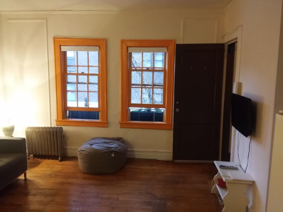
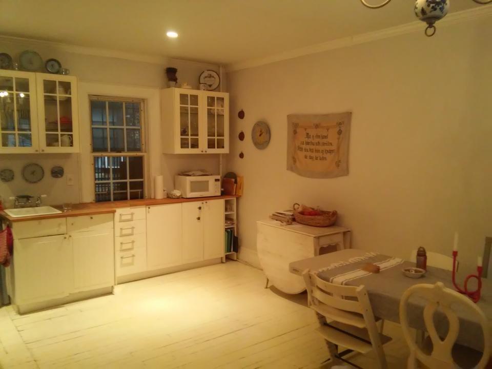
An Apartment in Pomander Walk Gets a Bright and Expansive Update

Claudia Oribe had been living in an apartment with her family for several years when she started yearning for more space. Moving wasn't ideal for obvious reasons but also due to the fact that she lived in Pomander Walk, the historically landmarked co-op on Manhattan’s Upper West Side that’s full of whimsy, storied history, and charm. Lucky for her, the dream scenario presented itself: The apartment above opened up. “With the chance to combine the two apartments, we jumped at the opportunity as that would make the most sense for us as a family,” says Claudia.
From there, the family enlisted the help of Sarah Jacoby and her architecture and design firm, which specializes in creatively restoring and reconfiguring spaces on a variety of scales. “The clients wanted something minimal but warm,” says Sarah. “They had the benefit of having lived in the lower floor for several years, so they understood the building and the place, so the renovation and combination design reflects that sense of connectivity to the environment.”
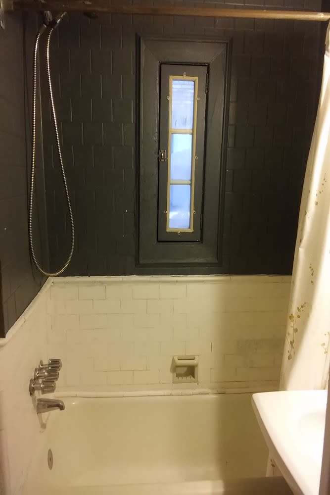
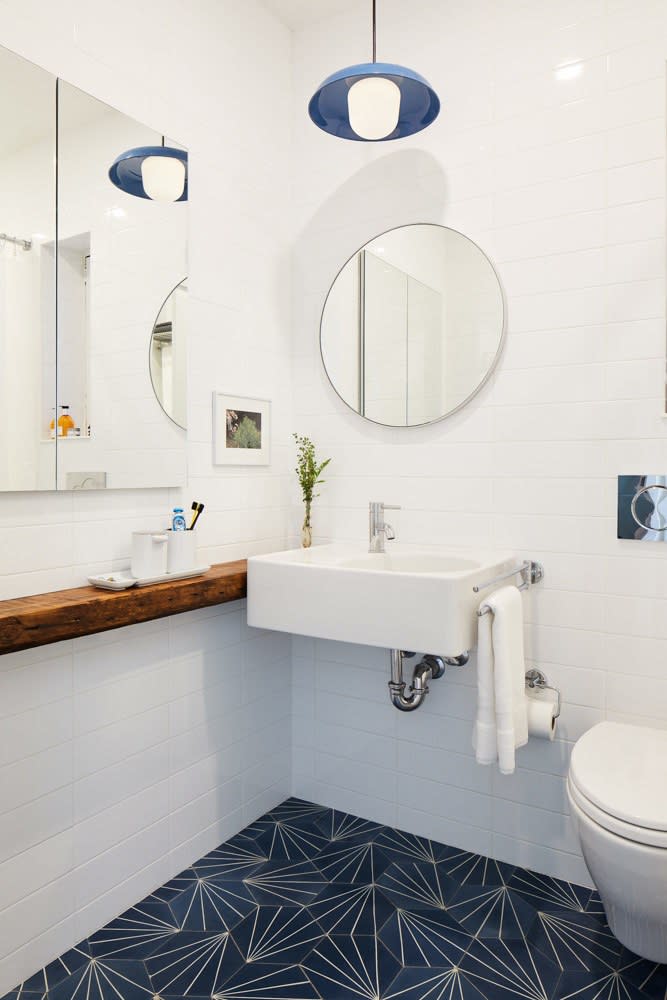
Of course, renovating a beautiful historic apartment complex doesn’t come without a few hitches, the main one being the rules and regulations that go along with making changes to a landmark. “The most challenging part [of the process] was getting permits from DOB and Landmarks Commission and coordinating the start of the project within that time frame,” says Claudia. Still, the team made it happen. “There was close scrutiny over all proposed changes,” adds Sarah. “We introduced a skylight, which was a particular challenge. It remains completely invisible from the exterior, but getting approval for it was a challenge.”
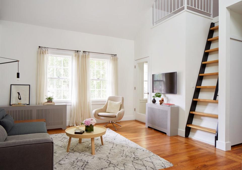
“We now have a unique space,” says Claudia. “It is still within a co-op structure, but we have a compact townhouse that feels very much like a house. Having no neighbors on top or below us has been so liberating!” Another aspect the family was excited by was opening up the ceiling at the top level and exposing the rafters. “We wanted to add an attic but did not know if we would have enough headspace, so it was amazing to find out that we had plenty,” says Claudia. “We ended up increasing our square footage just by doing that.”
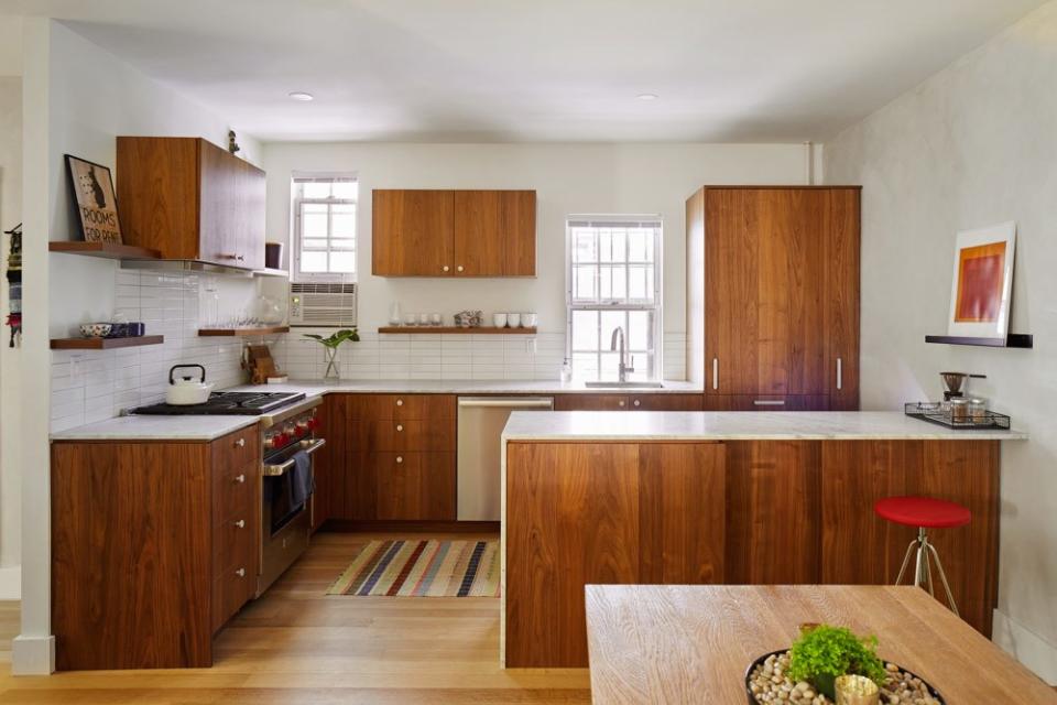
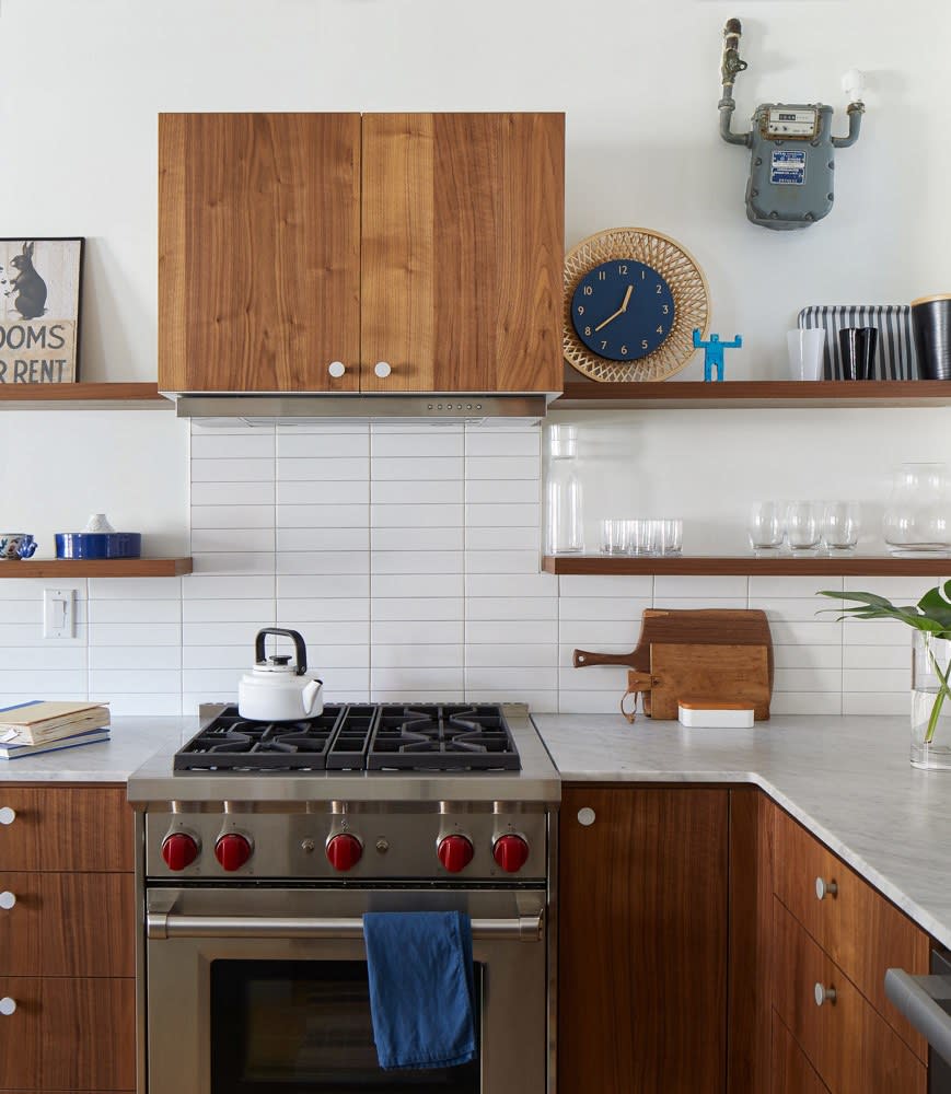

Bringing the vision to life was a very collaborative process between Sarah and the homeowners. They aimed to strike a balance between an informal feel and a point of view. “The clients had a clear idea of what they wanted, so we went back and forth with drawings, pictures, and ideas,” says Sarah. “Our budget was tight and non-negotiable, so Sarah helped us achieve that by managing expectations and making last-minute changes to the project,” adds Claudia. “Overall, the aim of the project was to lighten up the interior and update the layout to create a comfortable family home.”
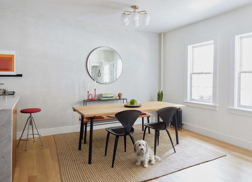
“Even though we designed the space to be very child-friendly, I am amazed by how well it has held up to daily use,” says Claudia. “It is a very relaxed and easygoing space.”


Originally Appeared on Architectural Digest

