
The maps that show if infections are getting higher or lower where you live

New data maps demonstrate where the coronavirus is increasing and decreasing in England.
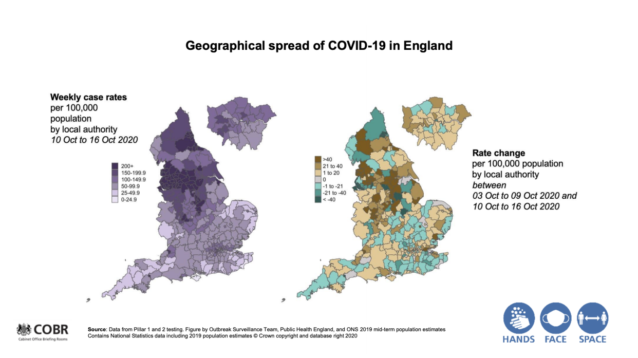
The maps (pictured, above), were presented at Thursday’s Downing Street press conference.
The map on the left shows overall infections per 100,000 people in the last week for which data is available, with the darker the purple shade, the higher the case rate. Therefore, it shows there are high numbers across the entire country.
The map on the right, however, shows whether the virus is increasing or decreasing from week to week.
The dark purple shades show infections are beginning to fall in some areas of the North West, which has been badly hit in the second wave of the pandemic.
However, the dark brown shades also demonstrate how other parts of the region are seeing sharp week-to-week increases.
Sir Patrick Vallance, the government’s chief scientific adviser, said: “In some areas, this has slowed down a bit, the rate of growth isn’t as high as it was in some areas.
“But overall, this is growing, continues to grow, and R [the reproduction rate] is above 1 so we should expect to see greater numbers.”
It comes after Sir Patrick presented separate data at the briefing suggesting up to 90,000 people a day are being infected with COVID-19 in England.
Watch: Boris Johnson admits to 'frustrations' over Test and Trace
Coronavirus: what happened today
Click here to sign up to the latest news and information with our daily Catch-up newsletter

