
Vancouver's buildings could be less boring, more colourful
Cold, grey, and dull.
I'm not talking about Vancouver's weather — I'm talking about its architecture.
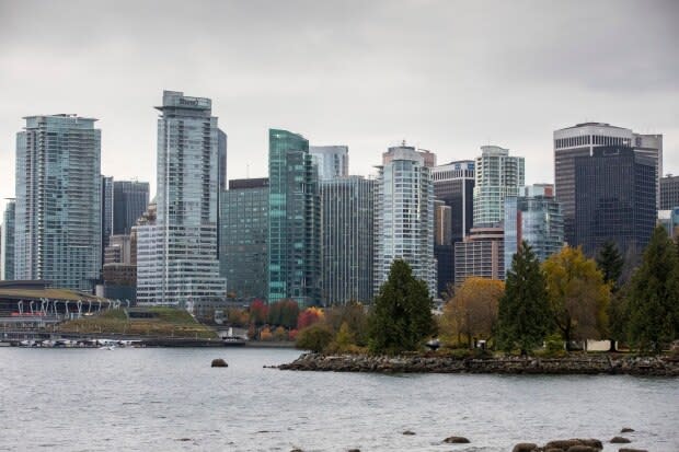
Just take a walk along False Creek or Coal Harbour and you'll find yourself surrounded by towers of glass in various inoffensive shades of light grey, blue, and that iconic seafoam green. But what about the rest of the colour spectrum? Why are Vancouver's buildings so lacking in colour?
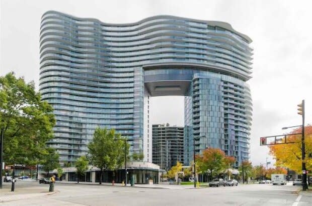
To answer this question, I started with a recently constructed condominium building called the Arc. You might have noticed its silhouette: a curvy, two-tower condominium development resembling a coffee maker next to the Cambie Street Bridge. The whole thing is covered in neutral blue glass, like nearly every other building around it. But this wasn't the original plan.

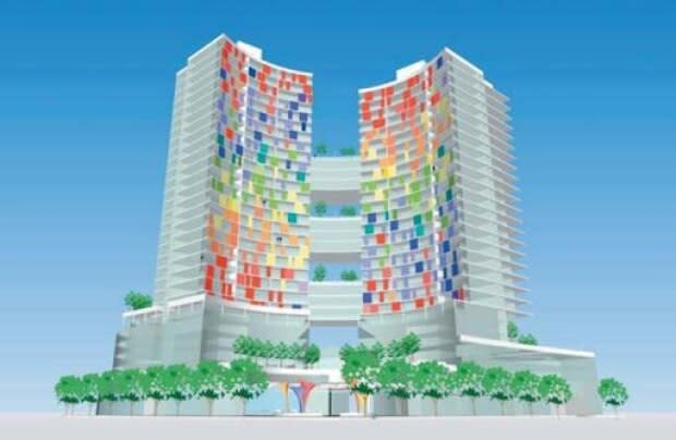
The first design for this site, submitted to city council in 2014, looked much different. Sure, the building itself doesn't look too special, but there's one thing that stands out right away — the colours!
It raises the question, how did we go from a rainbow mosaic to a monochromatic wall of glass? What happened?
To find out why buildings like the Arc meet an invariably grey fate, I reached out to a number of architecture firms in the city, as well as the developer, all of which declined my invitation to talk.
A representative for the City of Vancouver did take the time to write and said the Arc development was approved by the general manager of planning at the time but the city does not regulate which colours can be used.
Michael Kingsmill, manager of the Alma Mater Society's design and project services office at the University of British Columbia, had another explanation:
"I often find designers are uncomfortable using strong colours as they can turn out so terribly wrong when you take a paint sample and magnify it onto walls," said Kingsmill, adding there can also be financial considerations as accent colours can often take up to five coats to get full coverage and the upkeep can be costly.
Real estate pressure
I think there's another reason behind our de-saturated skyline and that's market forces.
The housing market is traditionally averse to bold colours. Real estate agents often recommend homeowners paint houses neutral colours so they appeal to as many buyers as possible.
This influence becomes a monolithic reality in downtown Vancouver. Our skyline is increasingly dominated by condominiums — buildings that are designed, above everything, to sell units. And in this city, with its astronomical land values and ever-increasing construction costs, I imagine the stakes are simply too high for a developer to take on additional risks with a building's colour. They'll build what they know can sell. The unfortunate aggregate effect is a repetitious and lacklustre city-wide colour scheme.
Vancouver isn't the only place subject to this phenomenon.
In 2016, architectural historian Hans Ibelings, in collaboration with Toronto architecture firm Partisans, published the book Rise and Sprawl, a study of condominium architecture in that city. As part of their research, they used algorithms to produce the most common colours of condominium towers.
The result? Grey, bluish grey, greenish grey, black, with some slivers of green or red.
The authors go on to describe these condominiums as "spreadsheets in the sky," or the "material manifestation of the developer's profit margin."
In some way, Vancouver's colours reveal its true colours — a city grappling with its identity in the midst of real estate speculation, condo-flipping and a housing crisis.
But despite all that, I think we should remind ourselves that our city has so much more personality than our buildings let show, one that is crazy rich and diverse in culture. Our architecture can (and should) reflect that.
Maybe we could start with some colour.

