
Freeform Introduces New Logo, The Network’s Third Since Switching From ABC Family in 2016
Freeform is “F”-ing around with its look. Literally. The Disney cabler’s new logo centers on two stylized “F”s (in “free” and “form”) that perpetually wiggle and move around in the network’s IDs. It’s part of a brand refresh instituted by Freeform president Tara Duncan, who took over the network in summer 2020, and her content marketing senior VP, Joe Ortiz, who joined the following spring.
“As Tara Duncan came to Freeform, we really wanted to refine who we were and who we were serving, and then ultimately connect the dots visually,” Ortiz says of the new logo and graphics package, which was launched on-air and online the week of Sept. 12 (tied to the premiere of new series “The Come Up”). “What we wanted to do is to create something that was modern and ownable and ultimately emotive, much like our audience. So, it was just a full Freeform evolution.”
More from Variety
Freeform's 'Everything's Trash' Casts 'The Outpost' Alum Anand Desai-Barochia (EXCLUSIVE)
'Black-ish' Alums Yara Shahidi and Marcus Scribner on How 'Grown-ish' Will Now Focus on Junior
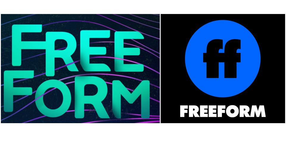
This reps the third logo for Freeform since the network was rebranded from ABC Family in January 2016. The original logo, in an aquamarine greenish blue, featured the name “Freeform” capitalized, but the letters somewhat jumbled. A new logo in January 2018 introduced a new trademark: The letters “ff” in bold black type, inside a blue circle, with the channel’s name in all-caps underneath.
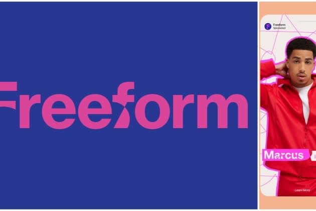
After four and a half years, Freeform has ditched the “ff” and has created its own proprietary font to use even beyond the logo. Freeform hired marketing firm Collins to help create the new visual identity and design system, which centers on the “Freeform” name, now spelled out with an uppercase “F” and the rest of the word in lowercase — and as of right now, all in pink. (Ortiz says other colors will be instituted as well.)
“Conceptually the idea is really rooted in this notion that they are constantly evolving and they’re always forming, much like our audience,” Ortiz says. “I think you’ll see it’s super malleable to all the different platforms. It was definitely built with social and streaming at its heart.”
At the center of it are those “F”s, which Ortiz says were designed to look like they’re moving, or about to move, even when the logo is static. “What we started thinking about is shape and looking at that curvature and the implied motion,” he says. “And so everything feels like even when it’s static, it’s moving or it’s about to move. Always at its heart, there’s the ability to change and an openness to change. So you’ll see that those Fs pay homage to that and then the curvature. To geek out a little bit, the curve and the arc of the Fs, those are the points by which we started to build the entire system. Everything tracks back to… the formation of that ‘F’ and then expanded from there.”
Freeform had created the “ff” icon to identify the channel in small places, like social media, where the name “Freeform” was just too big. But in ditching the icon, Ortiz says the network says, “What we wanted to solve is to make sure that the word ‘Freeform’ was the mark… What you’ll see is in certain [social media avatars] we’re bringing that beautiful ownable ‘F’ that is custom and that we own, and letting it live on his own. So, we can pull that out and use it as an icon.”
The new logo and brand identity comes as Freeform prepares for two of its biggest programming franchises of the year: “31 Nights of Halloween” in October, and “25 Days of Christmas” in December.
“The time really felt perfect for us,” Ortiz says. “First, we wanted to establish the look before any of our new originals are set to launch in 2023. But more importantly, I think is to really take advantage of those big programming tentpole stunts that we have. They just felt like the absolute perfect time to show off our new look to everyone.”
Best of Variety
Sign up for Variety’s Newsletter. For the latest news, follow us on Facebook, Twitter, and Instagram.

